5 Effects For Documentary Edits
If your footage looks "too clean," these are the tools you're missing. Five effects that shape how documentary style edits actually feel from raw motion to grounded color. Here's what each one does, and why it matters.
Intro 5 Effects For Documentary Edits
Documentary style editing has a specific feel footage that looks real, grounded, and a little imperfect on purpose. That feel doesn't come from a single filter or LUT. It comes from a handful of tools used the right way, at the right moment.
This guide breaks down the five After Effects tools that show up again and again in documentary style work: Posterize Time, Roughen Edges, Tritone, CC Page Turn, and Curves.
Each one solves a different problem motion that feels too smooth, edges that look too clean, color that feels flat, or transitions that need texture instead of a plain cut.
If you've ever watched a documentary edit and wondered why it feels more authentic than a standard corporate cut, these five effects are usually part of the answer. Below, we'll go through each one individually what it does, how to use it, and where it fits into a documentary style workflow.
1-Posterize Time
WHAT IT DOES AND HOW TO USE:
How to use it:
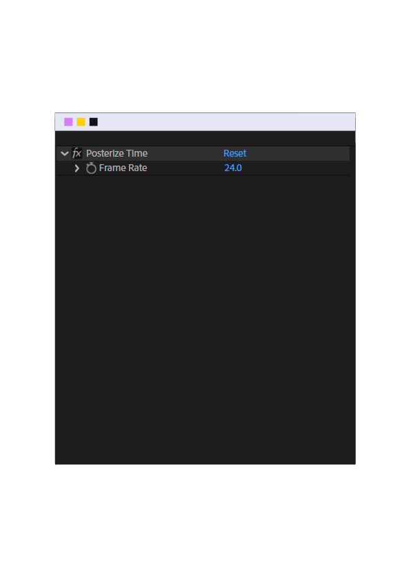
Drag the effect onto your clip, then set the "Frame Rate" value low (usually 8-12 fps for a subtle stutter, 4-6 fps for a heavier stop-motion feel).
Best applied to flashback moments, archival-style footage, or a dramatic pause moment not on interview talking heads, since it'll look broken rather than stylistic.
Practical tip:
Apply it on an adjustment layer over a specific section (not the whole timeline) so you can keyframe it in and out for a "memory glitch" moment, then back to normal playback
2-Roughen Edges
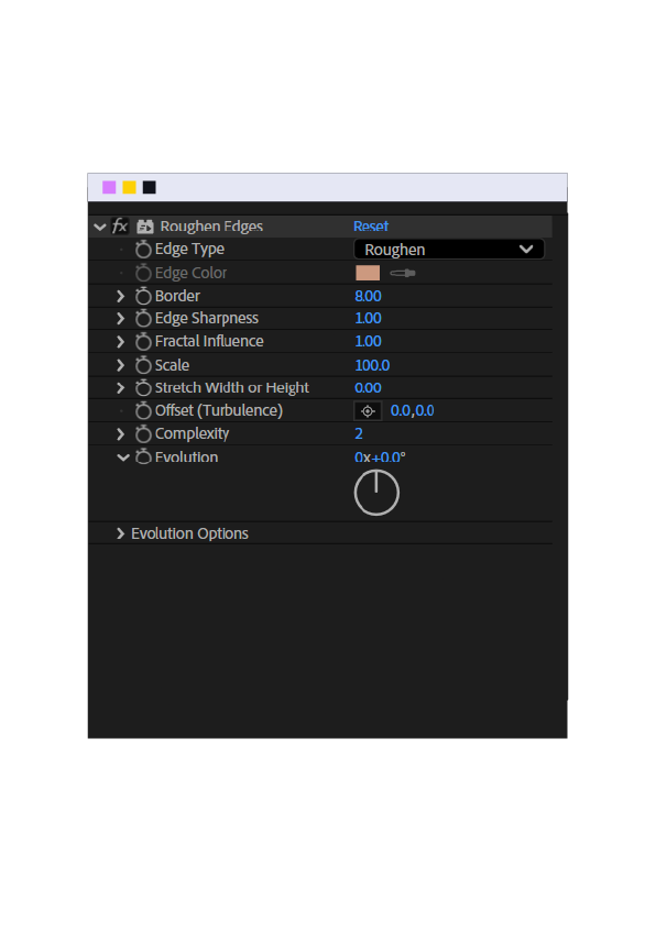
WHAT IT DOES AND HOW TO USE:
How to use it:
Apply to shape layers or text.
Key parameters:
Edge Type → set to "Rough" for a torn-paper look, or "Spiky" for a more aggressive hand-drawn feel
Border → controls how deep the roughness goes (keep it low, 2-5px, for subtlety high values look cartoonish)
Complexity → controls how detailed the roughness is (3-5 is usually enough)
Evolution → animate this over time (keyframe it) to make the rough edge subtly shift/breathe, useful on title cards or lower thirds for a handmade documentary feel
Practical tip:
Use it on title text or map outlines when you want an "investigative/handwritten" aesthetic very common in true-crime or historical documentaries
3-Tritone
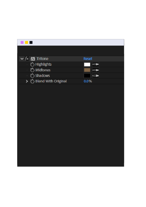
WHAT IT DOES AND HOW TO USE:
Tritone takes your footage and maps it to just 3 colors based on brightness levels, replacing the natural colors.
The 3 Values
Highlights : the color applied to the brightest areas
Midtones : the color applied to the medium-brightness areas (usually covers the most area in any shot)
Shadows : the color applied to the darkest areas
How It Works
If you set Highlights to yellow, every bright part of your footage turns yellow.
If you set Shadows to dark blue, every dark part turns dark blue.
Blend With Original:
A slider that controls how much of the effect mixes with the original footage.
Low value = subtle effect,
high value = footage fully converted to the 3 colors
4-CC Page Turn
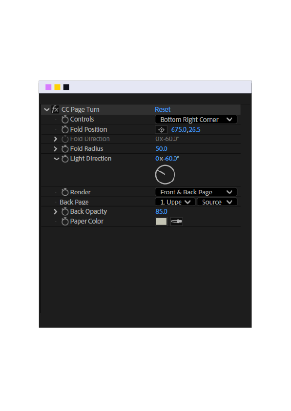
WHAT IT DOES AND HOW TO USE:
How to use it:
Apply to the layer you want to "turn away."
Key parameters:
Fold Position → sets where the page turn starts (usually a corner) Fold Direction → controls which way the page flips Render → set to "Page Turn" (default) for the peel-back look
Practical tip:
Use this specifically over photographs or archival documents (letters, old photos) to simulate flipping through a physical album not as a general scene transition.
Back Page:
Back Page controls what appears on the back side of the page as it flips since you won't keep seeing the front image once it turns, this setting decides what shows through instead.
Values
Leave it as None and it stays transparent (whatever's behind it shows through) Or assign it another layer a solid color, a darker version of the same image, or even a different graphic/logo
5-Curves
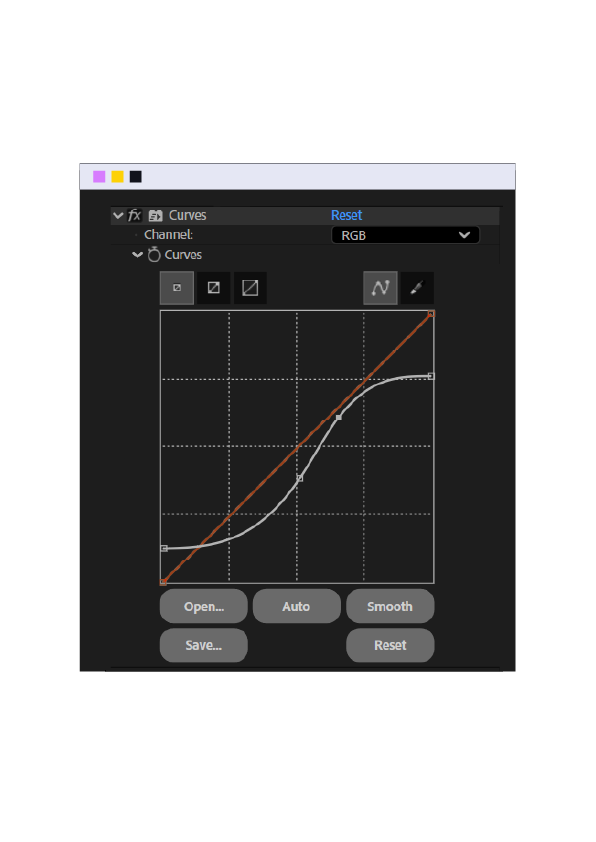
The Graph :
A diagonal line from bottom-left to top-right = no change (default state).
The Axis :
Left to right (horizontal) = the tones in your image, from black (left) → gray (middle) → white (right)
Up and down (vertical) = how bright or dark that tone becomes.
The Rule :
Click any point on the line, then:
Drag it UP → that tone gets brighter
Drag it DOWN → that tone gets darker Colors
So it goes like that :
Shadows (left point on the curve)
Drag it up → the dark areas become brighter
Drag it down → the dark areas become darker
Highlights (right point on the curve)
Drag it up → the bright areas become even brighter
Drag it down → the bright areas become darker/dimmer
Same rule applies to any point on the curve, not just the two ends
position = which tone range,
direction = brighter or darker.
-Switch the channel dropdown from RGB to Red / Green / Blue.
Drag that channel's curve UP → adds more of that color
Drag it DOWN → removes that color (pushes toward its opposite — e.g. lowering Red pushes toward cyan)
That's it..
position on the line = which tone,
direction = brighter/darker or more/less of a color.
Outro 5 Effects For Documentary Edits
That's the breakdown of the five effects that give documentary style edits their character the raw motion, the worn edges, the grounded color, the texture in your transitions. None of them are complicated on their own. What makes the difference is knowing which one to reach for and why.
The best way to get comfortable with them is to actually use them apply Posterize Time to a moving shot, push Tritone until you find a grade you like, experiment with Curves until the axis starts to make sense. Once these become second nature, they stop being "effects" and start being part of how you naturally edit.
If you want to see how they come together in finished work, our library has a few documentary style scenes built around these techniques.